
A CSS wheel of fortune
A lot of what I do at Points is to bring to life small experiences to engage customers following some form of email or them arriving at our partner’s storefronts. Recently a partner got in touch asking if we could do a “wheel of fortune” style spinner when they visit the page revealing the prize a customer had won.
The prize is predetermined, however in an effort to keep things interesting we introduced a bit of randomness, where the user’s prize would appear at different positions on the wheel for each page load. Making it look like it’s different each time, when really they’ll always get the same prize! You can refresh as much as you want, but the prize will always be the same.
Skip to the CodePen demo to see it in action if you don’t want to read about the how and the why.
Background
When initially approached about this idea I was expecting the request to be recreating something along the lines of the wheel featured on “the price is right” with one prize being visible at the front with the wheel rotating around vertically “in front” of the users.
Thankfully the partner specifically supplied us with the image of a more “wheel of fortune” like prize wheel, that being the vertical, elevation of a wheel that spins centered on the screen with all prizes visually rotating around the center point. Thankfully this is the easier of the two (I still want to try and build the other too).
Desired Experience
Customer receives communication about their “special prize” of up to
X% discount. They visit the web page that loads a wheel of fortune spinner. Clicking “spin”, the wheel slowly reveals their prize.
Let’s first breakdown what we’re after here. The wheel is made up of a number of sections, I’m going to call ‘slices’. Each slice represents a prize the customer has a chance of winning, featuring some centered on the slice, pointing toward the center.
What makes one of these wheels recognisable? There are three things I thought of to get that authentic “Wheel of fortune” effect. The visual ecstatic, movement, sound. For the sake of my own sanity I decided to leave sound at the door, no one want’s to hear that clicking noise when they load a web page (do they?)!
Visual Aesthetic
These wheels have a very distinctive look and feel, iconic almost. The slices or wedges, featuring their alternating colours, the “handles”, and the labels on each all centered around the circular board.
Initially I was going to just use a background image for the wheel and PhotoShop the prize wheel together, but that’s no fun at all. I opted for a refined HTML/CSS solution (only featuring a small amount of JavaScript that I will get on to later). I started off by getting some scss variables set up with some useful numbers around the area, angle of our wheel. Hope you all paid attention during Math to work out the arc of a circle!
$diameter: 350px;
$numberOfSlices: 12;
$radius: ($diameter / 2);
$circumfrance: (6.283185307 * $radius);
$sliceHeight: ($circumfrance / $numberOfSlices);
$sliceOffeset: ($sliceHeight / 2);
The wheel, in essence, is just a rotating div element with a border radius of 50% with overflow set to hidden to cut it into a circle.
The wedges are where this gets challenging. My example has 12 slices in total, nice and even. As all the wedges are the same, I focused my attention on creating one something that could repeat Nth number of times and that are adaptable so if I need to reduce my wedge count or something like that I don’t have to throw out the entire project!
How To Build A Wedge
With the wheel made up of multiple slices. Each one has a container with the class of slice which we use for rotation and positioning. The label is for, you guessed it, the label or the content of that slice.
<div class="slice">
  <div class="label">Label Text</div>
</div>
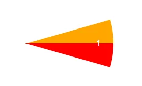
From that we use :before and :after pseudo-elements to blocks before and after our label. Using CSS triangles before and after the label we can create the wedge shape we’re after. Like so:
Once the first slice was working. We just repeat them for however many slices we want. We set each slice use the tip of the triangles as the transform origin point: transform-origin: center left;, this allows us to rotate each slice around our center points. The hidden overflow on the parent div then hides everything past the border-radius giving us a curved wedge!
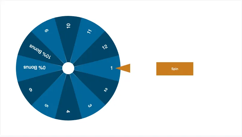
All put together we have something that looks like this:
    <div class="spinner-table">
        <div class="dial">
            <div class="slice"><div class="label">01</div></div>
            <div class="slice"><div class="label">02</div></div>
            <!----------- Skip a few for brevity ------------->
            <div class="slice"><div class="label">11</div></div>
            <div class="slice"><div class="label">12</div></div>
        </div>
    </div>
Putting the slices together.
We’ve got our 12 “slices” we now need to spread them out evenly around the wheel. Before we start, each slice needs its transform origin moved to the middle-left point to replace the motion of it pivoting around the center point of the circle.
We’ve got 12 slices in this example we need to work out how many degrees to rotate each one to cover the wheel. Which is 360 / 12 = 30 So each slice needs to be rotated 30° from the previous slice which would fan out the slices over the wheel. This can be done with a tactful use of the nth-child selector in CSS, like so:
.slice {
    transform-origin: left center;

    &:nth-child(1) { transform: rotate(0deg); }
    &:nth-child(2) { transform: rotate(30deg); }
    /* Skip a few for brevity */
    &:nth-child(12) { transform: rotate(330deg); }
}
 Add a few static bits and buttons, and we’re almost there!
Motion
Now we’ge got the board put together it is time to bring it to life. The real challenge here was the animation timing. After watching a few episodes of wheel of fortune as “research”, I noticed a few people trying to build momentum by pulling the wheel back before throwing it forwards, then the wheel slowly decreasing in speed, until the force of the arrow pulls it back slightly.
Without this pull-back animation the wheel just abruptly starts spinning and then stops, while using the default keywords like ease and ease-in didn’t have quite the right feel.
To get this effect to look and feel natural with CSS timing functions we need to make use of the mysteriously powerful cubic-bezier() timing function. The four arguments of this function defines a Cubic Bézier curve. I would like to pretend I know fully how the maths behind this works but, sadly, I do not. I made use of this wonderful CSS easing animation GUI by Matthew Lein, to generate the curve with the draw-back and slow spin, until a tiny bounce, feel we were trying to get. Here it is in all its glory:
.elm {
  animation-timing-function: cubic-bezier(0.44, -0.205, 0, 1.13);
}
Making the loading random.
This part requires a bit of JavaScript. To make things random I needed two things. First I needed to make the slices appear in a random order each time the page loads, and second I need to somehow make the spinning animation land on the correct, predetermined prize, while the list is in a random order.
I removed all the slices from the HTML leaving the dial as just an empty <div />. I moved my prizes into an array that I can then shuffle to give us a random order, that we then iterate over to generate a randomised dial. The shuffle function is one I found on StackOverflow after searching “how can I shuffle an array”?
const prizes = [ 'Prize A', ..., 'Prize L'];
Now our “winning” prize is in a different position each time the page loads, so we need to adjust the animation to ensure the dial ends on the correct slice each time. Finding the prize position in the array is just a matter of using prizes.indexOf() looking for the prize we want after the list has been shuffled.
Using this number we can then use that to adjust a spin offset. The “offset” is the rotation required from the starting position to the prize, you can calculate it by dividing 360 by the number of slices we have (12) and then multiply that by the prize position. If our winning tile is in position 4, we need the wheel to spin 120deg to land on the correct tile. (360 / 12) * 4 = 120.
Just spinning to your prize doesn’t look right. The wheel would need some full rotations to make the effect believable. To add initial rotations to the wheel before it settles on a prize we add spinCounts to the mix, which after multiplying by 360, and subtracting our offset gives us a rotation value that we can use in our animation.
Great so we have our rotation amount as a variable in our JavaScript, great, now how do we get this value into our CSS? Enter DOM manipulation. By dynamically creating a script tag in the <head /> with our keyframe animation name and using CSS template strings to create our CSS rule using our spin value. Throw it all together and we get this:
function updateAnimationNumbers(prizePosition) {
  const spinCount = 3;
  const offset = (360 / 12) * prizePosition;
  const spinValue = 360 * spinCount - offset;

  const styles = document.getElementById("dynamic").sheet;

  const CSSTemplate = `
    @keyframes spinning {
      from { transform: rotate(0); }
      to {  transform: rotate(${spinValue}deg); }
    }
  `;

  styles.insertRule(CSSTemplate, 0);
}
Results
See the Pen Spinner Banner Element PoC by James R. Williams (@jamesrwilliams) on CodePen.
Overall I’m pretty happy with how this turned out. We shall have to wait and see if it helped conversions, but I doubt it! I tried to do this with as little JavaScript as possible, in an effort to reduce complexity, in hindsight however it may have been easier, but we do love a challenge. The only JavaScript in this project shuffles the “slices” on load and then adjusts the rotation number to ensure it always ends on the winning tile!
BrowserSupport is impressive for something this complex. For those older browsers that don’t support things like :psudo elements and CSS animation/transitions, a graceful fallback is in place that just shows them their prize. Luckily the application the final code went into kicks anyone IE9> to an upgrade page, so I didn’t have to worry too much about those oldies!