front-end
Recreating the field set <legend> effect, just without the field set
The Ask
I had a dilemma. A seemingly simple design element that featured a line of text with a border starting from each end and stretching out to the edge of the container. Something like this:

Note the background gradient. My first idea here would be to plop a background color fill that matches the background on the text to obscure a border behind it. But that lovely background gradient we’re using does not allow for that. Even if you matched the background gradient perfectly, the approach would not really work for images or be very responsive.
TL;DR Here is the CodePen demo.
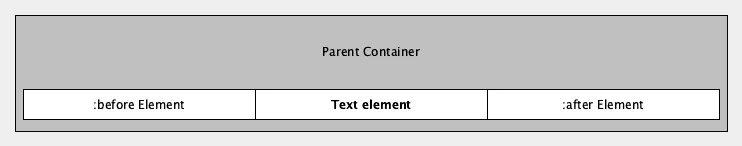
This effect reminds me of the <fieldset>’s legend element that would create a label that’s space was cut out of the lovely border it defaulted to. For example here is an actual HTML rendering of a field set and a legend element too.
Semantically these elements are really useful however you hardly see them anymore I feel. The issue is I just want the top part of this and I really don’t want to use the fieldset element as it has semantic value that we don’t want to add to our page. So my goal is to recreate this effect in a way that does the following:
- Dynamic Backgrounds - Supports the background color / image or gradient that may be used behind it.
- Responsive - Ensure this works properly on smaller devices, not causing over-scroll or other strange effects. This goes without saying these days.
- Minimal code - Smallest file size, minimal css etc.
You know the effect. A bit of text and then a key-line running out of both the left and right sides. The thing is usually. So in an effort to make myself not forget how to do this properly.
Demo
So my next idea was to use both the ::before and ::after pseudo elements to create the lines that precede and follow the text element. Straightforward enough right? So our final implementation would look something like this:
Getting started
First let’s setup the label element and the pseudo elements.
<div class="label">
  <span>Center text</span>
</div>
Just a note: You don’t need to use the exact same elements but just take note of.
.label {
  text-align: center;

  &::before,
  &::after {
    content: "";
    height: 10px;
    width: 10px;
    display: block;
  }

  &::before {
    background: red;
  }

  &::after {
    background: blue;
  }
}
Which should look something like the following. A good starting block:

Position? Absolutely!
Next off we need to get the before and after blocks to stick to the text element regardless of how long the text gets. Absolute positioning to the rescue! Let’s set both the ::before and ::after elements to position absolute with the associated left and right properties set to zero to sick them to the edges. We will need to set the parent .label element to position: relative; in order to contain the newly absolutely conditioned pseudo elements.
.label {
  // ...
  position: relative;
  // ...
}
// ...
&::before {
  left: 0;
  background: red;
}

&::after {
  right: 0;
  background: blue;
}
Result
We’ll I managed it! With many things I was certainly over thinking it initially, and I’m sure there is an easier way to do this but this is an ample solution for my needs. Check out the CodePen mock example I’ve put together or see the full code here:
.label {
  overflow: hidden;
  padding: 10px 0;
  text-align: center;

  > span {
    display: inline-block;
    padding: 5px 20px;
    color: #444;
    position: relative;

    &::before,
    &::after {
      content: "";
      position: absolute;
      background: #ccc;
      height: 1px;
      width: 9999px;
      top: 50%;
      display: block;
    }

    &::before {
      left: 0;
      transform: translatex(-100%);
    }

    &::after {
      right: 0;
      transform: translatex(100%);
    }
  }

  &-left {
    text-align: left;

    > span {
      padding-left: 0;
    }

    &:before {
      display: none;
    }
  }

  &-right {
    text-align: right;

    > span {
      padding-left: 0;
    }

    &:after {
      display: none;
    }
  }
}
https://codepen.io/jamesrwilliams/pen/OYwowM
See the Pen Responsive Label Effect by James R. Williams (@jamesrwilliams) on CodePen.